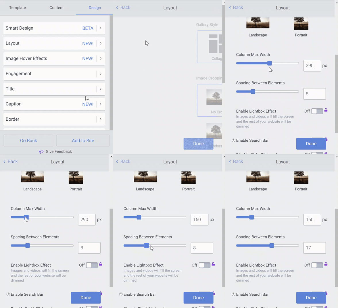
The width of a POWR Gallery or Social Feed is controlled by by two factors:
- the width of individual columns.
- the width of the frame where the app lives.
Column Width
You can adjust the width of your Gallery or Social Feed's columns inside the POWR Editor.
- Open the Design section
- Go to Layout.
- Use the sliding scale to set a maximum width for your columns. Columns will now maintain this width across all device types.
For example, your app might display 3 columns on a wide computer screen, but only 1 column on a narrow mobile phone.
You can also adjust the spacing between columns.

Frame Width
Frame width is controlled by the website theme or template which you are using. All POWR Apps live inside a frame on your website, and can only be as large as that frame will allow.
For example, your website template might have a wide content area in the middle, and a narrow sidebar on one side. The same gallery might display 3 columns when added to the wide content area, but only one column when added to the sidebar.
Frame width is not something you can control through POWR. Instead, you'll need to edit your website's theme, template, or HTML file through your site builder. Here are some resources to help you get started:

Comments
0 comments
Please sign in to leave a comment.