Building an email in the builder (Shopify)
The email builder is where you design your email.
The layout
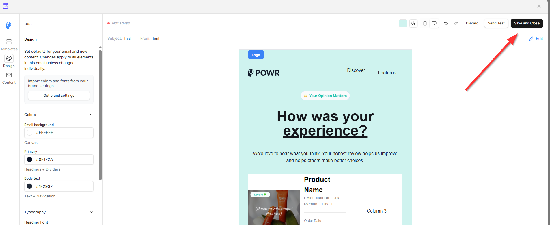
Canvas (preview): on the right, showing your email as it will look.
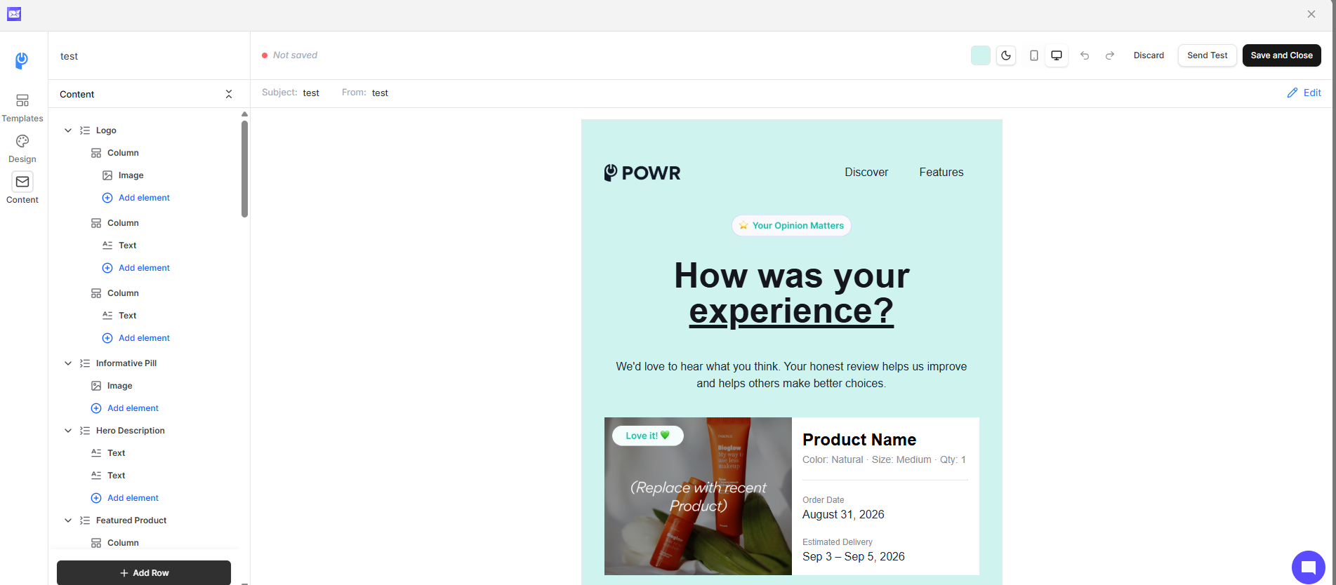
Content builder: on the left, listing the elements you can add and the settings for whatever you've selected.
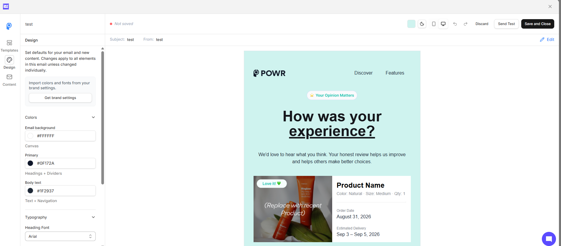
Design settings: overall styles that apply across your email.
To edit any part of your email, click it in the canvas, then change its settings on the left.
Adding and moving elements
Add an element from the content builder on the left. To reorder elements, drag them within the content builder (from the list on the left, not on the canvas). To delete an element, use its delete option. You'll be asked to confirm.
Elements
Text. A full text editor with alignment, font size, and padding.
Heading. Like text, with heading sizes, font, color, alignment, size, weight, line height, and padding.
Button. Set the look and the destination URL. Replace the default
#with your real link.Image. Upload one, or use an image from your Brand Kit. Set a redirect URL, round the corners, and adjust alignment, size, and spacing.
Product. Add a product with image, price, sale price, description, and button. Add several and arrange them in columns to make a grid.
Social. Paste your social links. Choose a dark or light icon style and adjust size.
Navigation. A row of text links, usually at the top or bottom. Edit each link's URL, label, font, size, color, and alignment.
Divider. A simple line you can style.
Footer. Contains your mailing address and unsubscribe link. Required and can't be deleted, though you can style it.
Splitting into columns
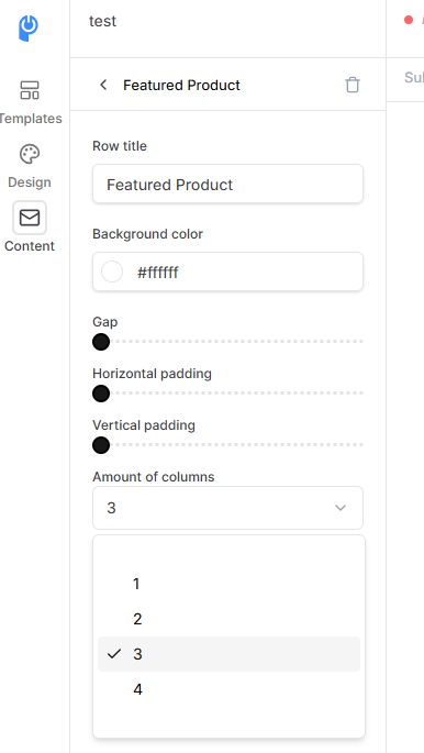
Add a row.
Open the row's settings.
Set the number of columns and their widths (split evenly or custom, like 60/20/20).
Add elements into each column.
Design settings and syncing
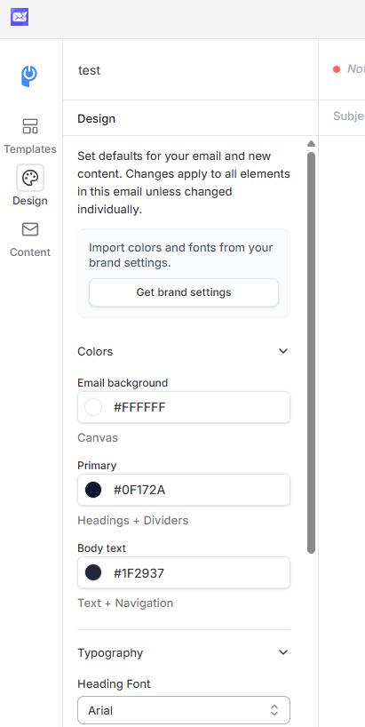
Design settings make fast, email-wide changes. When synced, any new element picks up those styles automatically. If you edit one element (say, a red button), it unsyncs from the design settings. Use Apply design settings to re-sync. Set your overall background color in the design settings; to change one section's background, open that row and set it there.
Previewing and testing
Mobile view: check how it looks on a phone.
Light and dark mode: preview each.
Send a test: send yourself a copy before it goes out.
Saving
Click Save and close. Your email is not auto-saved.
Some elements are still being optimized for mobile. Preview on mobile before sending.